Movie posters speak volumes about the film in their first look. The theme, setting, mood, and genre are disclosed, inciting your expectations and pulling you out of your seat to watch them. Ready to know more about the design and features that make up the movie poster? Glide down to learn more.
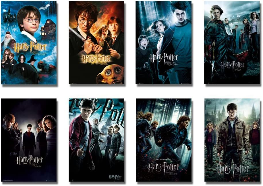
A movie poster signifies the release of a film and attracts the viewer’s attention to arouse their curiosity. In this sense, a movie poster is said to be successful when it has enthused a set of audience and led them to the theater to watch the movie it portrayed. Although a movie poster is not an absolute necessity, it still makes a difference in improving your film’s audience awareness. Hence, this article outlines the basic steps to make a movie poster in addition to the tools required.
What Is A Movie Poster?
You design a movie poster to entice potential filmgoers to watch a movie. Hence, it furnishes certain significant information about a movie to its viewers. They include:
- Movie title
- Names of actors and actresses who feature in the movie
- Directors
- Producers
- A visual that represents the movie
- A ‘tagline’ or teaser
Movie Poster Expert Explains Color Schemes | Vanity Fair
Benefits of a Movie Poster
There are several benefits you can derive from designing a movie poster. However, the most commercially important function is to:
- Promote a studio’s movies
- Attract the audience’s attention to make them watch a specific film.
Apart from these, a movie poster serves as a powerful communication tool in conveying the following information to your viewers:
- Find the movie genre.
- Broadcasts the main idea.
- Introduces the main actors.
- Demonstrates the director’s statement.
Every Marvel Movie Poster, Explained | Vanity Fair
A Brief History of Movie Posters
Movie posters have been an integral part of the history of movie-making. In the beginning, short films were projected using film posters. Hence, they were often cramped with information regarding the cast, directors, list of titles, and producers. However, the evolution of movie posters began when hand-drawn pictures enhanced their commercial potential. As a result, several movie studios began to employ artists and graphic designers who created hand-drawn posters. Later, these posters were reproduced using lithographic printing. Further, the following years saw a drastic change with the help of technology.
The History of the Hollywood Movie Poster
| 1960 | The movie posters featured hand-drawn illustrations of movie stars. |
| 1970 | Photography came to use. |
| 1980 | Imagery dominated the space and the titles were moved to the bottom. |
| 1990 | Posters came in different forms to cater to billboards and magazines, creating a brand identity for movies. |
Today, movie studios continue to use the brand-marketing approach. However, the posters are distributed across print and online channels.
A Look at Some of the Most Iconic Movie Posters in the History of Film
How to Create a Movie Poster?
Pick the right tools
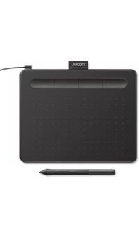
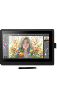
Before creating a movie poster, you must have the right tools to ensure your work emerges successfully. Some of the must-have tools include:
- It is always best to start your career with a tablet like a Wacom Cintiq.
- Alternatively, you can also use an iPad and install apps like the Astro pad to make it a Cintiq.
Choose an Appropriate Software
With the evolution of technology, poster artists began using digital software to design their posters. Although there is no specific program for creating one, you can use Adobe Photoshop or Affinity Photo for photo-dominant designs.
Adopt the Two-Way Thinking
When it comes to creating a movie poster, you always have to think in two ways:
- The ideological way is when you have to observe and analyze to get a clear picture of your wants.
- The technical way deals with knowing how to fit your wishes into what is available.
Here are some steps to thoughtfully craft your poster:
Understand the main idea of the film and gather important information
To begin with, you need to be clear in understanding the movie’s vision. This will help you generate fantastic imagery to fill your poster. In addition, you must maintain a clear list of the cast crew and the list of producers and directors.
Decide on the poster style
An appropriate poster style will project your story through your poster. Hence, choose your style based on the purpose. Some of the reasons for which posters are designed majorly include the following:
Teaser
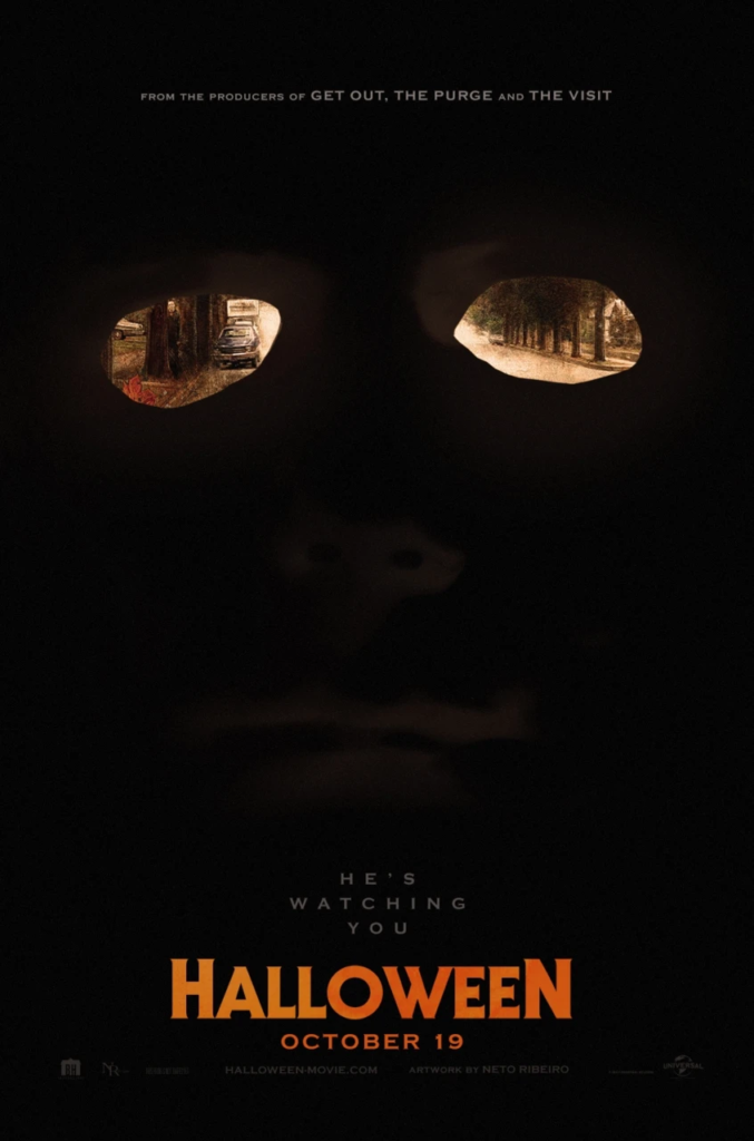
A teaser poster is something that announces the coming of a movie. Consequently, it creates a stir about the film among its audience. Generally, teasers are released during a movie’s development and may indicate the tentative release date. They may feature some of the styles mentioned below:
- Teaser posters contain only the title or a symbol associated with the film.
- They may be devoid of movie credits.
- Words like “coming soon,” “In Theatres This Summer,” or the abbreviation “Adv,” “Advance,” or “Teaser” are prevalent.
- The main character is portrayed as looking at something in the distance.
Source: Talenthouse.com
Pay Off Key Art
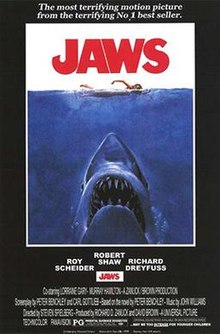
The final movie poster is released once the shoot for the movie is completed. As a result, it furnishes more information than a teaser. Some of the details that appear in these posters include:
- Names of the film stars
- Movie Tagline
- Production crew information
- The distributor’s information
Sometimes, the main poster for a movie comes in more than one style. Still, it varies depending on a movie’s title and budget.
Source: Wikipedia
Character Sell
Character posters are designed when the movie studios or distributors decide to produce them. It highlights a specific movie character, usually displaying the actor’s name and the character played. In addition, these posters may also contain a tagline associated with the character.

Source: Etsy.com
Decide on the Poster Size
To decide on the movie poster size of your choice, you must first be aware of the standard sizes available. They include:
| Measurement | Aspect Ratio | Purpose | |
| One-sheet | 27 by 40 inches, or 686 by 1016 mm | More than 2:3 | To promote movies in theaters. |
| 40 by 60 inches or 1016 by 1524 mm | 2:3 | To advertise movie posters at bus stops and subway stops. | |
| Architectural D | 24 by 36 inches | These are movie posters available only for retailers to sell to their customers. |
Once you are clear about your purpose, you can select an appropriate size and work on it further.
How to Design the Perfect Poste
Select Auxiliary Images
Additional images help you convey the essence of a story through the poster. To decide on the right pictures, you must know the film’s genre. In addition, you have to be clear about the mood you wish to convey. The different types of the genre include the following:
Types of Movie Genres
Comedy / Romance
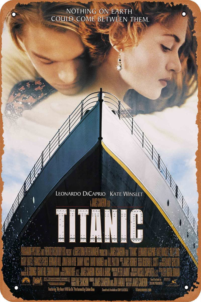
Comedy or romantic films must feature amusement and humor to entertain their audiences. Hence, a poster for a comedy film must use bright and optimistic color palettes in its typography, graphics, and costumes to instill these feelings. For this purpose, you can adapt expressive photography and character photographs. In addition, the presence of laughter or humorous facial expressions will enhance the mood of the poster. For romantic comedies, pastel colors are well-suited.
- Fonts: You can choose rounded fonts like Cooper Black and Stripes.
Action/ Adventure/ Family
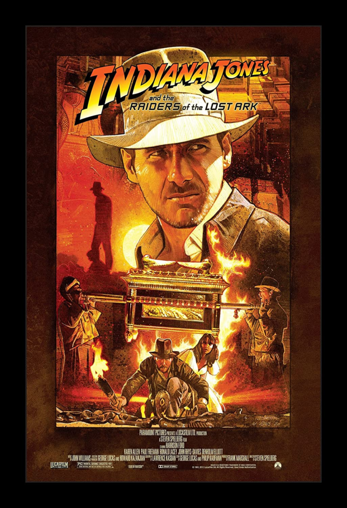
Action, adventure, and family movies are filled with moments of urgency and energy. Hence, the posters for these movies must emphasize movement and color. However, it is essential to understand the significance of the color red for action movies as it indicates passion and energy. To make your poster immersive, you need to move to look realistic and dynamic.
- Fonts: Textured, haphazard, or condensed fonts can further reinforce these feelings.
Drama
Movies of the drama genre are pretty diverse and emotionally appealing. These movies may be portrayed in different periods or settings. Since this genre is unique in its diversity, they offer room for creativity while designing. To enhance the emotional mood of the poster, you need to refer to its cinematography or characters. Once through, you can photograph dynamic character portraits or dramatically photograph from a film still to achieve atmospheric designs.
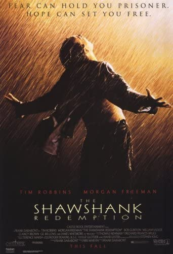
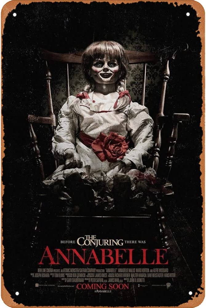
Murder/ Mystery/ Horror
The horror/ mystery/murder genre posters should evoke a terrifying sensation. This will make them more memorable and impactful. They must also contain symbols like blood, weaponry, silhouetted figures, and ghostly shapes to enhance a sense of mystery. To make your design more enticing, you can also refer to the plot or theme of the film. It would help if you opted for dark, moody color palettes with white or blood-red text.
- Fonts: Period-type styles or bloodied lettering
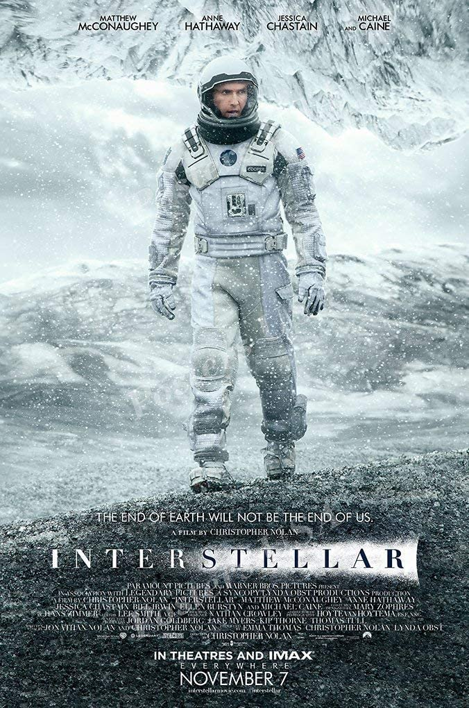
Sci-fi/Space/Animation
Sci-fi movies require a minimalist poster design. To impart an ethereal feeling, you must include neon-colored palettes combined with inky blacks and blues. In addition, you need a space or planetary background with robotic-inspired graphics. Finally, to portray the atmospheric lighting that mimics the luminosity of the stars, you can include glow and other light effects in your designs.
- Font: Ultra minimal fonts like Futura.
Therefore, based on the different film genres, you can choose the right fonts, background, and design to portray the right mood for a specific movie.
Ordering the Information on the Poster
Once you decide on the images to feature on the poster, you must add other vital information. Before venturing to order the information you wish to display, you need to understand a billing block.
Add a Tagline
A tagline conveys the gist of the story with a few words. Hence, it has to be memorable the moment your viewers see it. In addition, it has to tell the story of the entire images that follow it.
Poster Title
When preparing a movie poster, your poster title will be your movie name. However, to retain your audience’s interest, you need to keep the text as simple as possible without any effects.
Title Design: The Making of Movie Titles
Movie poster design in photoshop | Photoshop cc 2022
What are Billing Blocks?
A billing block is usually found at the bottom of the poster featuring the name of the cluster of movie credits. They are often found in condensed fonts. The billing block represents those who have worked for the movie and their contribution level. The billing block is placed following the mandate from The Writers Guild (WGA) and Directors Guild (DGA)that movie credits must be at least 15 percent of the size of the movie title.
How to create film poster billing in photoshop
Add Billing Credits To The Bottom of the Poster
Presentation Credit
Initially, you have to include the presentation credit that belongs to the distributor before the title.
XYZ Films Presents
In case another company partners with you to finance your movie, you have to add them as:
XYZ Films Presents
in Association With XYZ Industries
If one of the key producers owns a production company in that case,
XYZ Films Presents
in Association With XYZ Industries
A Will Smith Production
If there is a director with additional movie credits, then you must include them with “A film by” or “A so-and-so film.”
XYZ Films Presents
in Association With XYZ Industries
A Film by
A Will Smith Production of Jack Lee film
Cast
The list of cast members follows the presentation credit. You have to start by listing the prominent actors. This is because audiences will select a movie based on their interest in the star. Some stars even negotiate to prioritize their names to feature before the title while you list. This process is termed top billing. You can typically feature around 2 to 3 actors after the title in the billing block, and these locations are referred to as the first position,” “second position,” and “third position.” In addition, there may be an introduction label.
Crew
The crew members include the people who worked on the movie. They are often listed in a standard order as follows:
- Casting by
- Costumes by
- Edited by
- Production Designer
Some of the other members who are often negotiated and placed include:
- Director of Photography
- Music by
- Original score by
However, in case of an absence of negotiation, you can first place the people who contributed the most in order. In addition, certain unions or societies mandate their mention following the crew member’s credits. Hence, please keep track of those memberships and mention them appropriately in your billing block.
Producers
You can feature the producers of the movie in the below order:
- Producer
- Executive Producer
- Co-producer
- Associate Producer
Writers
Any film features several writers. If your script is based on a novel, you can include it as:
From a novel by J.K.Rowling
(Or)
Based on characters by J.K.Rowling
Writing Teams
Writing teams may consist of members who wrote the screenplay or produced material without a screenplay. For example, if Roddy and Gary wrote the script and Richard and Daniel developed the story, you might include them in a below-mentioned way.
Story by Richard & Daniel
Screenplay by Roddy & Gary
Direction
The last movie poster credit in the billing block is direction. If the director of the movie is also the one who wrote it, you can put it in your credit as:
Written and Directed by Bob Kensey
What’s the Other Stuff at the Bottom?
- Logos
- The official rating from the M.P.A.A.
- Your website
- Social media accounts
- Hashtags
- Release date
Publish the Poster
The final step in creating your movie poster is publishing it. For this purpose, you require publishing software like Adobe InDesign or Affinity Publisher. They are advantageous because:
- You can establish control over both typography and images
- You can adapt your poster to various page sizes.
Final Thoughts
Apart from being a fun activity, poster making for movies has to be cautiously done as it decides a movie’s reach to its audiences. However, ensure you convey all the turning points without spilling the climax. In addition, movie posters carry a good amount of information regarding the cast and the crew who worked on the movie.
Videos
How to make an epic movie poster


